Menu
And a bit of publication design—really more of a smattering of the many other types of work I’ve done that didn’t fit neatly into another larger category.
A small business brand attempting to blend personal meaning and wider appeal.
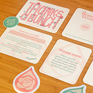
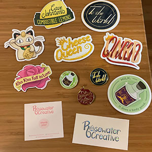
The current suite of printed brand materials: a thank-you card, a backing card for pins and keychains, a version of the thank-you card for gift recipients, logo sticker freebies, and stickers to brand the outside of shipping packages.
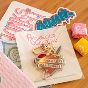
An example of what goes into a packed order: a thank-you note (with handwritten personalization), some candy, and of course the ordered items.
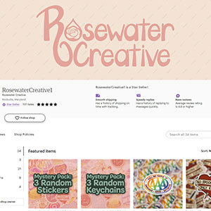
A screenshot of the Etsy storefront, also showing off some examples of product images.
My small launch inventory and brand materials from 2011. The business card was super cool but definitely overkill...
The logo even die-cuts well, as seen adding some pizzazz to my Cricut.
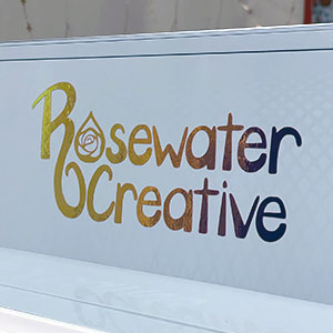
Does this logo seem familiar? I liked how it turned out so much, I took the rosewater icon from this logo and used it in my personal branding too!
Before launching Rosewater Creative in 2021, I spent a lot of time preparing—not only researching things like suppliers and e-commerce platforms, but building a solid foundation for the brand and even the name itself. Given my history of naming things in rather…esoteric ways, I wanted to blend personal meaning with wider appeal this time and thus landed on roses/rosewater—roses are my favorite flower and carry personal significance, and rosewater reflects my Persian heritage. Roses may be somewhat “basic,” but at least they are recognizable! Once that was set, the name and imagery flowed naturally from there. Of course, I still had to inject some extra “symbols” into the logo—the tail of the R and the bowl of the C form a sort of vase, and the rose inside that droplet is inspired by my most popular design from a previous business, for example.
To create the rest of the branding suite, I drew inspiration from other small businesses serving similar markets whose approaches I liked, buying lots of indie art and collecting notes and materials from their unboxing experiences. I integrated everything I learned and created what I hope is a positive customer experience peppered with personal touches—a personalized note, repeat buyer recognition, freebies for larger orders, candies as a fun surprise—my own ideal unboxing experience.
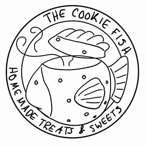
A charming, hand-drawn logo for a tiny cookie business—with an equally charming backstory.

The logo in context: on a cookie package and on a business card.
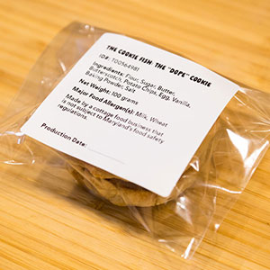
The ingredient label on the back needed to be flexible enough to accommodate new labels for new recipes on a nearly weekly basis.
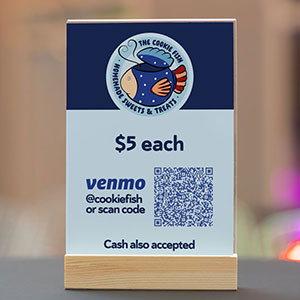
The pricing and payment information card that would be displayed next to the cookie display.
The initial logo sketch.
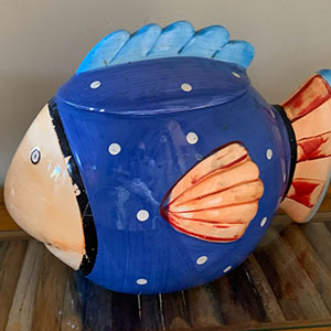
A reference photo of the brand's namesake: a ceramic cookie jar shaped like a fish.
This project was a unique opportunity to develop a brand truly from scratch, as I came to it before the business even had a name! I was able to use my branding know-how to guide the client’s brainstorming process toward a direction that felt right for them, and eventually they settled on an identity that would honor the origins of their love of baking: their late mother, who used to bake cookies every week and store them in a unique ceramic cookie jar shaped like a fish. Hence, The Cookie Fish!
Everything came together fairly quickly after that—the client wanted to lean into the quirkiness of the source material with a friendly, “homemade” vibe for the brand, so I simply illustrated our fishy friend (with some minor modifications to make it more logo-y) and built the logo around that.
Hand-lettered branding I used across my portfolio, YouTube channel, Twitch channel, social profiles...everywhere!

YouTube channel art after moving away from my old username entirely. I also used the lettering on my resume and this very portfolio!

YouTube channel branding including some thumbnails and the old-school endscreens that allowed for so much customization! I miss those.

Gaming content got its own sub-brand with an inverted color scheme and little cartoons of myself and friends who joined me, heavily inspired by the Game Grumps "Grump Heads."

Eventually, when I started my Twitch channel, I carried the inverted color scheme over to that as well.
I really did/do like using this lettering everywhere—here's a doodle on a wall (designated for doodling!) of the Stedelijk Museum from 2017. I wonder if it's still there!
A version of this lettering in an art piece from 2014 inspired by The Art of Asking by Amanda Palmer.
This style of lettering is something I was doodling on things long before it became my personal brand. It wasn’t planned or developed—I just really enjoyed finding new ways to fit different letterforms together like a puzzle using these somewhat chaotic shapes. I’d use it to decorate my script binder for shows I was in, when I felt like getting a little fancy addressing Christmas card envelopes, and even in the occasional art project. So, after rather inadvertently “practicing” and fine-tuning it over such a long time, this lettering winding up as my branding was probably inevitable. It wasn’t my first ever personal branding iteration (it was, I think, my third or fourth?), but even now after I’ve retired it, it holds a special place in my heart (and portfolio).
Because part of the fun of it for me was fitting different combinations of letters together in new ways, I never actually standardized it into a typeface or asset library—each use of this lettering across every platform over all the years I used it was “made to order,” so to speak, with limited exceptions. I’m usually a slow letterer, but I got real quick at this style!
Some odds and ends from my time with the manufacturing tech company.
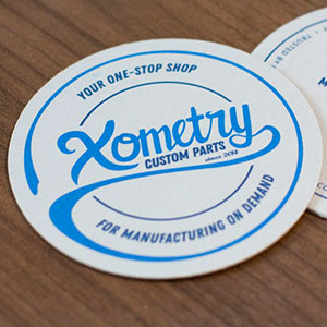
A coaster given out as a freebie to customers to always keep our name and offerings close at hand.
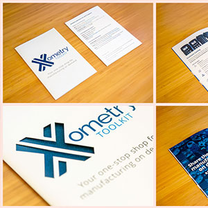
Covers and spreads of a quick-reference booklet, including a close-up of the die-cut front cover.
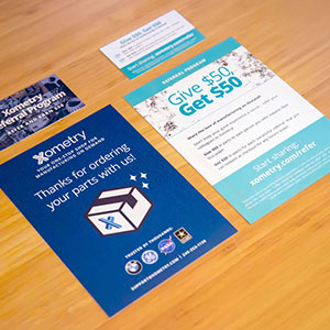
Business cards and order pack-in cards advertising the referral program.
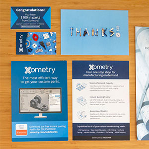
A small selection of other miscellaneous flyers, ads, and cards.
I was at Xometry when it was still mostly a scrappy startup with just one designer each for all of marketing (me) and all of product, so I was constantly jumping around between different media, audiences, and use cases. Social media graphics, emails, landing pages, whitepapers, conference booth materials, digital and print ads, flyers, mailers, merch, product photos, investor decks, leadership headshots, all sorts of videos—you name it, I did it. This is just a tiny selection of print materials I created during my three years there.
The coaster actually started as an internal t-shirt design but was popular enough to warrant reformatting it for something we could easily distribute to customers as well. The tail of the Y extends to create a border echoing a ring left by a coffee cup, and I even came up with a coffee pun to bring it all together (and I don’t even like coffee!). The reference booklet was an enormous undertaking, working with the engineering team to distill thousands of words of technical content down to brief summaries—while still retaining the information’s integrity for our fiercely detail-oriented customer base—and then laying it all out in an attractive package. The referral program materials feature a sub-brand I created to complement the main branding with brighter, “friendlier” colors and themes evoking “sharing the love” and celebration. Images of many diverse parts stand in for the many diverse industries and customers we served, and I photographed CNC shavings to play the role of confetti (including making stop-motion animations with it)!